

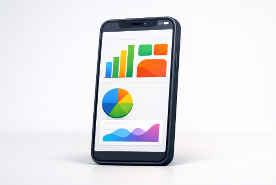
In today’s fast-paced digital world, professionals depend on mobile dashboards to obtain real-time insights anytime, anywhere. As mobility becomes the norm, the need for well-designed mobile dashboards intensifies. Effective mobile dashboards make data accessible and actionable at a glance by leveraging thoughtful structure and clear presentation. Successful design requires prioritizing both usability and visual clarity, ensuring users can quickly and easily interpret key metrics. For design inspiration, many teams study examples of dashboard UI screens to understand which design patterns help users navigate complex data on smaller screens.
A user-centric mobile dashboard helps prevent information overload. Streamlining layout, optimizing interactivity, and focusing on responsive, adaptive formats are essential best practices for modern dashboard design. High-performing mobile dashboards offer intuitive navigation across devices, maintaining visual consistency while providing quick access to essential metrics. Achieving this delicate balance improves workflows and drives better decision-making at every level of an organization.
Prioritize Simplicity and Essential Metrics
One of the core principles of mobile dashboard design is focusing on simplicity. With limited screen real estate, mobile dashboards are not suited for deep analysis or complex visualizations. Instead, present only the most vital Key Performance Indicators (KPIs) so users can grasp insights immediately. Streamlining the interface by displaying 3–5 widgets in each section prevents data from becoming buried or overwhelming. Executive summaries and headline numbers are particularly effective, as they provide instant clarity at the top of the dashboard. A study by the Nielsen Norman Group found that users can absorb information more efficiently when clutter is removed, making the interface more intuitive and approachable.
Ensure Responsive and Adaptive Layouts
As users interact with dashboards on a variety of devices and orientations, ensuring flexibility through responsive design is vital. Implementing a fluid grid system allows the layout to automatically adjust to the given screen size, improving readability whether users are on a compact phone or a large tablet. Media queries enable developers to stack elements vertically on smartphones, providing a single-column format that highlights key information. This approach not only makes dashboards more accessible but also ensures consistency across device types. For further insights, Smashing Magazine discusses patterns and technical tips for designing truly responsive dashboards.
Optimize Visualizations for Small Screens
Complex charts that function on desktops can become unreadable on smaller displays. Mobile dashboards require visualizations to be concise and easy to digest. Eliminate any non-essential data, opt for summary charts over detailed ones, and use short, clear labels. Choose chart types with high data-to-ink ratios and use recognizable color schemes for clarity. Simple bar graphs, line charts, and pie charts are usually enough to convey trends without the need for interactive drill-downs. Clear labeling and intuitive legends also help make the visualization understandable with minimal effort.
Simplify Navigation and Interactivity
Mobile dashboard navigation needs to be immediately intuitive to reduce the learning curve for new users. Use simple menu structures with key tabs and minimal layers, avoiding deep nested options that slow users down. Hamburger menus, tab bars, or bottom navigation bars work well for surfacing main dashboard functions. Touch targets for buttons and interactive elements should be large enough for comfortable tapping, generally following guidelines such as a 44×44-pixel minimum. Features such as swipe gestures and pull-to-refresh can further enhance user interaction, keeping the overall experience smooth and responsive. For more ideas on streamlining navigation, see the Google Material Design guidelines for mobile navigation frameworks.
Maintain Consistency in Design Elements
Visual and functional consistency ensures that users are not confused as they navigate the dashboard. Uniform fonts, colors, and iconography help establish a logical information hierarchy. Group related metrics into visually defined sections and apply the same layout patterns throughout the dashboard. Applying consistent use of whitespace and color coding helps guide the eye and reduces cognitive overload, which is critical when designing for quick scans of data. Developing a cohesive style guide for dashboard UI elements is a recommended step to maintain long-term design consistency.
Test and Iterate Based on User Feedback
Even the most carefully planned dashboard can reveal weaknesses when launched to users. Continuously test on multiple devices to catch usability issues. Gather feedback on important metrics and ease of finding information. Use real-world data to iteratively improve layouts, interactions, and features. Regular maintenance keeps the dashboard aligned with user needs and business goals. Harvard Business Review highlights the value of integrating user feedback into development. Mobile dashboard best practices, clear metrics, responsive layouts, simple navigation, visual consistency, and user input help deliver relevant, effective tools that empower users with actionable insights.
Conclusion
In conclusion, effective mobile dashboard design hinges on clarity, adaptability, and user-centric thinking. By prioritizing essential metrics, simplifying layouts and navigation, and optimizing visuals for smaller screens, teams can deliver insights that are both accessible and actionable. Consistent design elements and responsive structures ensure a seamless experience across devices, while ongoing testing and user feedback keep the dashboard aligned with evolving needs. When thoughtfully executed, mobile dashboards become powerful tools that enable quick decision-making and enhance overall user engagement.
